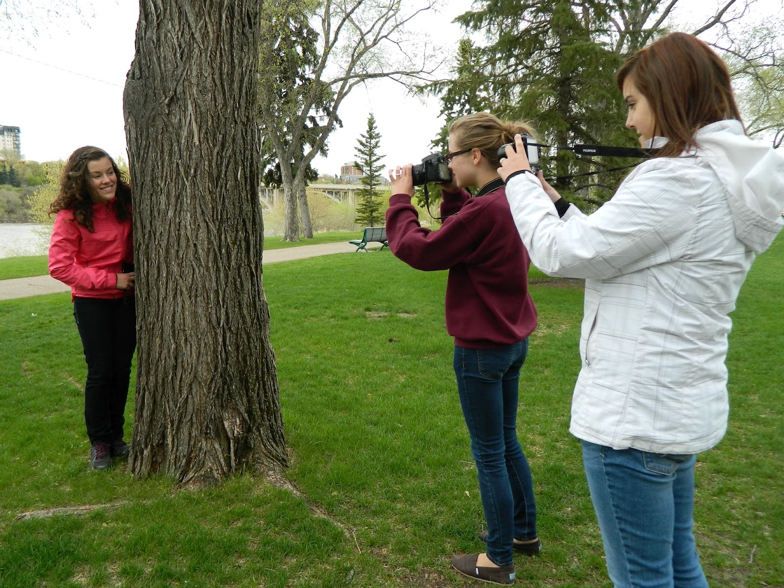
In this photo I wanted to go for the rule of thirds but to continue to keep the picture interesting. We read from left to right and I like how Bailey is wearing a bright color to continue to give a visual interest, since the colors pops from the rest. I enjoyed how Madi and Tessa were angling out of the way from the tree and not in-line to much, but drawing wards in to direct the attention back to Bailey.

I really like this photo, and how the gate Tessa was leaning against had a unique design. I preferred to take a photo of her off center to make a better illusion that she had 'wings' but that were from the gate. The building in the back gave the photo more of a fairy style feel with the castle and her wings. I don't think I followed any rules here but in itself I think that picture is effective the imagination.

For this photo I like how it creates depth preciption. I liked how the trees helped to make a path inwards to create a path, so it helped to lead your eye down the cement path.

For this photo it leads your eye, from the lines inside the tunnel. Not only does it lead your eye but its was taken because it looked good from the angle focusing on the top of the roof more than the outside of the tunnel.

This picture is creating depth preception, the rock statue in the front is bigger than the backround. The building in the backround is way smaller then the object in the fronts. I like the vivid color in the backround of the green grass. It follows two rules in photography, it sorta follows the rule of third and the rule of depth.

This happens to be one of my favorite photography's ive taken. This picture is focused on the necklace and its vibrant colors, behind it is the U of S. I liked how that back was blurred out but that the angle of the buildings in the back weren't straight but tilted. With the two building it leads your eye down but its blurred, and so your eye show draw back to the necklace.
No comments:
Post a Comment